Brand guidelines · Whimsical Romance · Spring 2027

pieces anchored in beauty. . . style, off course.
For women who dress by instinct, not instruction. This page is the single reference for the mark, the palette, the type, the voice, and the two pieces that go on the garment: the label and the hang tag.
01 · The mark
A signature, not a logotype.
The wordmark is hand-lettered script with two hidden ligatures: the double-s of brass sets sail, and the l of sailor drops anchor. Never redraw, re-space, or typeset the name in a script font. The mark is the artwork.



- Ink or Gardenia only, never the accent colors, never a gradient.
- Clear space: keep one anchor-height free on every side.
- Minimum width 140 px on screen, 35 mm in print. Below that, use the seal.
- The details above are cut from the wordmark itself, never redrawn. The seal is the anchor reversed out of an Ink disc. It holds its shape down to a 32 px tab icon.
02 · Color
Whimsical Romance.
A warm, sun-faded coastal palette. Grounds and inks do the everyday work; Garnet Rose speaks briefly; everything else is seasoning.
Grounds
Warm bones: every page and photo sits on one of these.
Inks
Chocolate-browns, never true black. The wordmark prints in Ink.
The wine
Garnet Rose is the accent: the script sign-off, the underline. Plum Wine is its deep pour.
Compass & coast
Supporting naturals. Sepia points the way on eyebrows, labels and wayfinding; Sierra is its printed twin on the hang tag; the greens and coral stay editorial.
03 · Type
One voice, from the chart table.
The type comes from the Style Compass cards: an old printer’s italic for everything that speaks, its small capitals for everything that labels, and a quiet sans for everything you read at length. Each face has one job. Use the role, never the face by hand.
.headline-1 · .headline-2 · .headline-3Sentence case. The closing clause sits in <em> and turns Garnet Rose. Never bold, never tracked.
For women who dress by instinct, not instruction.
.eyebrow · .fell-scWrite it in sentence case: the face draws its own small capitals from the lowercase. Never uppercase it, track it lightly.
Spring 2027 · the lookbook
Look IX · the lace capelet · Joslyn Castle
AnchorLockupThe only place Playfair appears: the anchor and the name at the foot of a card, a tag, the footer.
Brass Sailor.script-signoffLowercase, sparingly: once on a surface, never a headline, never the brand name.
style, off course..handWritten on a print and nowhere else.
BS11 · lace capelet.body-copy · .body-letter16px in Ink for the page; 18px (19px on a wide screen) for a long letter like About.
Pieces inspired by the past to redefine the future: vintage textiles, modern silhouettes, lace and satin and soft florals you’ll want to live in.
Each of these was on the site once. None of them belongs.
- No Playfair headlines. Playfair is the lockup, and only the lockup.
- No Inter Light. Body is Inter Regular, in Ink.
- No tracked capitals in Inter. A label is IM Fell SC in sentence case.
- No handwriting outside a print. The hand is for Polaroid captions.
One way to ask.
- IM Fell SC, sentence case, a hairline underline that fills in on hover.
- The arrow is set in Inter: IM Fell has none.
- One primary on a surface; the rest go quiet or ink.
Three ways to pause.
.ruleBetween a headline and its text, or a small break.
.chart-ruleBetween two sections of one page.
ChartBreakBetween two chapters. Once or twice a page.
04 · Voice
Instinct, not instruction.
Lines we sail by
- “pieces anchored in beauty . . . style, off course.”
- “For women who dress by instinct, not instruction.”
Names we’ve chosen
The lexicon, set now so it stays consistent. Only reSail and the Style Compass have a page today.
- reSail: the archive. One-of-ones, samples, prototypes, reworked vintage.
- The Style Compass: the living archive of looks a hangtag opens onto.
- Just Sailed: what new arrivals will be called.
- Letters from the Helm: what the newsletter will be called.
How to write it
- Nautical words are seasoning, one per surface, never a theme park.
- Script lines are lowercase; headlines and eyebrows take sentence case, and a headline ends on its clause in Garnet Rose.
- The spaced ellipsis “. . .” is ours: three periods, breathing room between.
- Say instinct, wander, helm, harbor. Don’t say must-have, obsessed, or drop.
05 · The label
Printed, so the hairline survives.
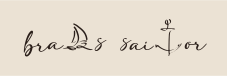
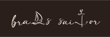
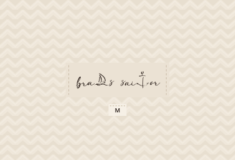
The neck label is the wordmark, nothing else: Ink on Sea Pearl for pale pieces, Gardenia on Ink for dark ones. It is a printed satin, not a weave: the script’s thinnest strokes sit under a tenth of a millimetre at label size, and a damask fills anything finer than 0.3 mm. Woven, the sailboat and the anchor would come back as blots. Printed, they come back as drawn.
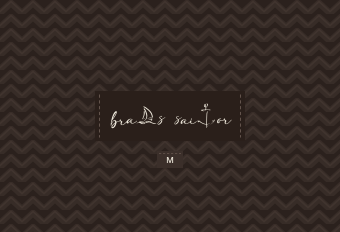
| Size & format | 60 × 20 mm visible, end-fold. Add ~7 mm fold allowance per side → 74 × 20 mm cut |
|---|---|
| Construction | Printed satin (polyester), ultrasonic or heat-cut edge, soft hand. Not woven (see above) |
| Light colourway | Ink #2a1f1a on Sea Pearl #ebe2d4. For pearl, gardenia, oat and pale grey pieces |
| Dark colourway | Gardenia #efe9dc on Ink #2a1f1a. For ink, chocolate, plum wine and navy |
| Choosing one | Match the ground to the garment, not the season. Between the two, take the darker: a pale label on a mid tone reads as a patch |
| The wordmark | 50 mm wide, centred, nothing beside it. The file is the traced vector (logo/brass-sailor-wordmark.svg), so no font and no redrawing is involved downstream |
| Not on this label | Size, care, fibre, origin and RN# stay on separate legally-required labels |
06 · The hang tag
The name on the front. The compass on the back.
The front is quiet: the wordmark, the sign-off in Garnet Rose, the seal at the foot. The back is the Style Compass, the same compass mark the site draws, retoned to Sierra, with the hangtag code laid inside it exactly as section 07 describes. Scan it with the piece in your hand and it opens onto every look the piece belongs to.
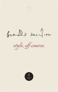
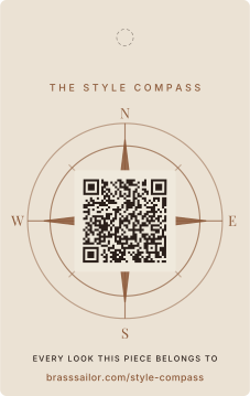
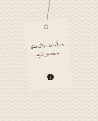
| Size & drill | 60 × 95 mm, 1.5 mm corners. 4 mm hole, centred, 9 mm from the top. The dashed circle is a guide, not printed |
|---|---|
| Stock | 350–400 gsm uncoated, matte, in Gardenia, or white stock with the front flooded Gardenia and the back Sea Pearl, so the pair reads as one tag |
| Ink | Front: Ink #2a1f1a + Garnet Rose #8a2f44. Back: Ink + Sierra #8c5a3a for the rose and the wayfinding lines. Three spots in all; short runs may go digital, matched to hex |
| The code | The hangtag code from section 07, 20 mm across its modules with its quiet zone kept clear on Gardenia. Scan the proof before it goes to press |
| Finishing | No foil, no lamination. Optional blind deboss of the seal on the front |
| String | Natural jute twine or unwaxed cotton cord, never a plastic barb |
07 · Codes
Two codes, one destination each.
These are the only two Brass Sailor QR codes. Use them as they are: Generate a new one and you get a code nobody has scanned, checked, or can vouch for.
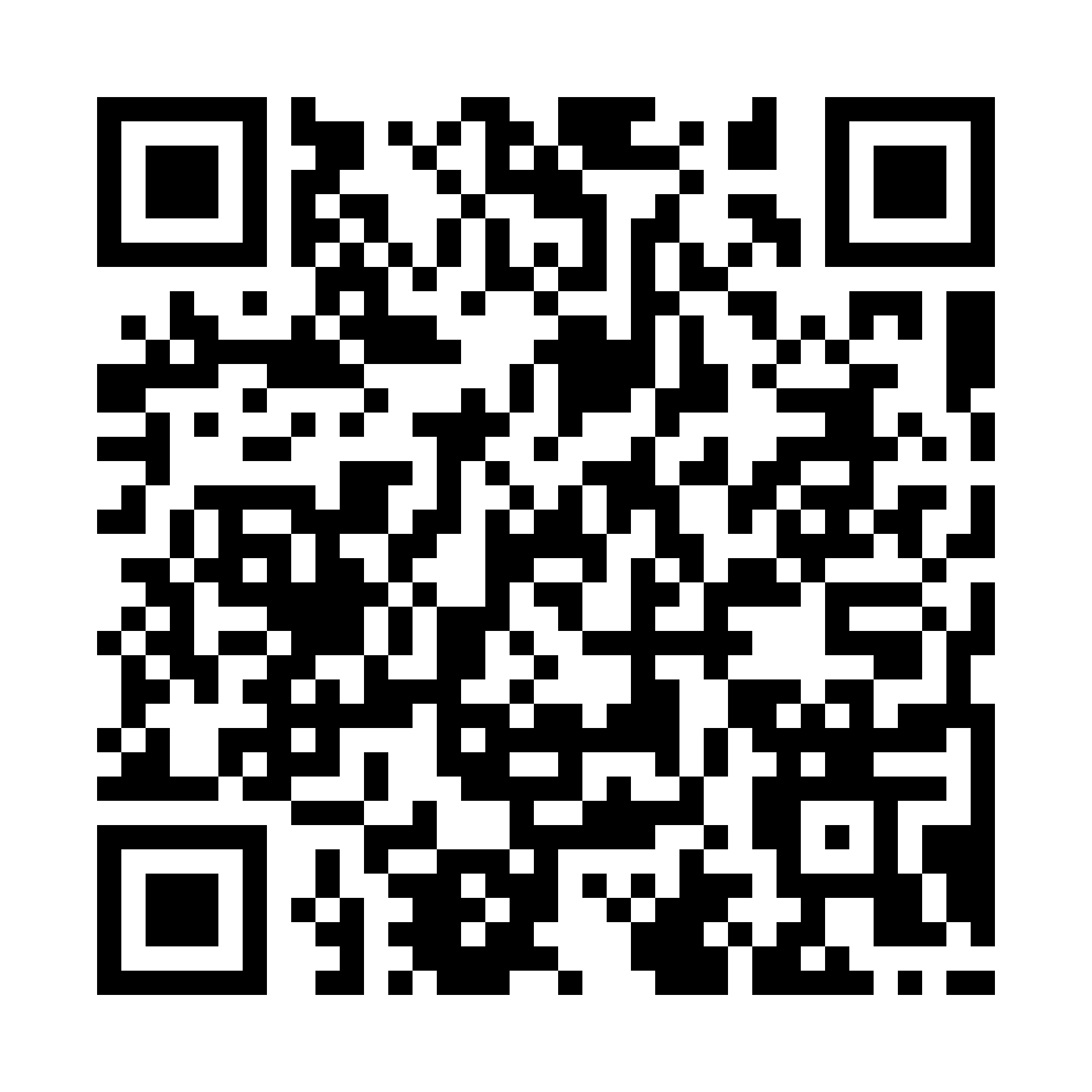
Sits inside the compass rose on the Style Compass hangtag. This is the one a customer scans with the garment in her hand.
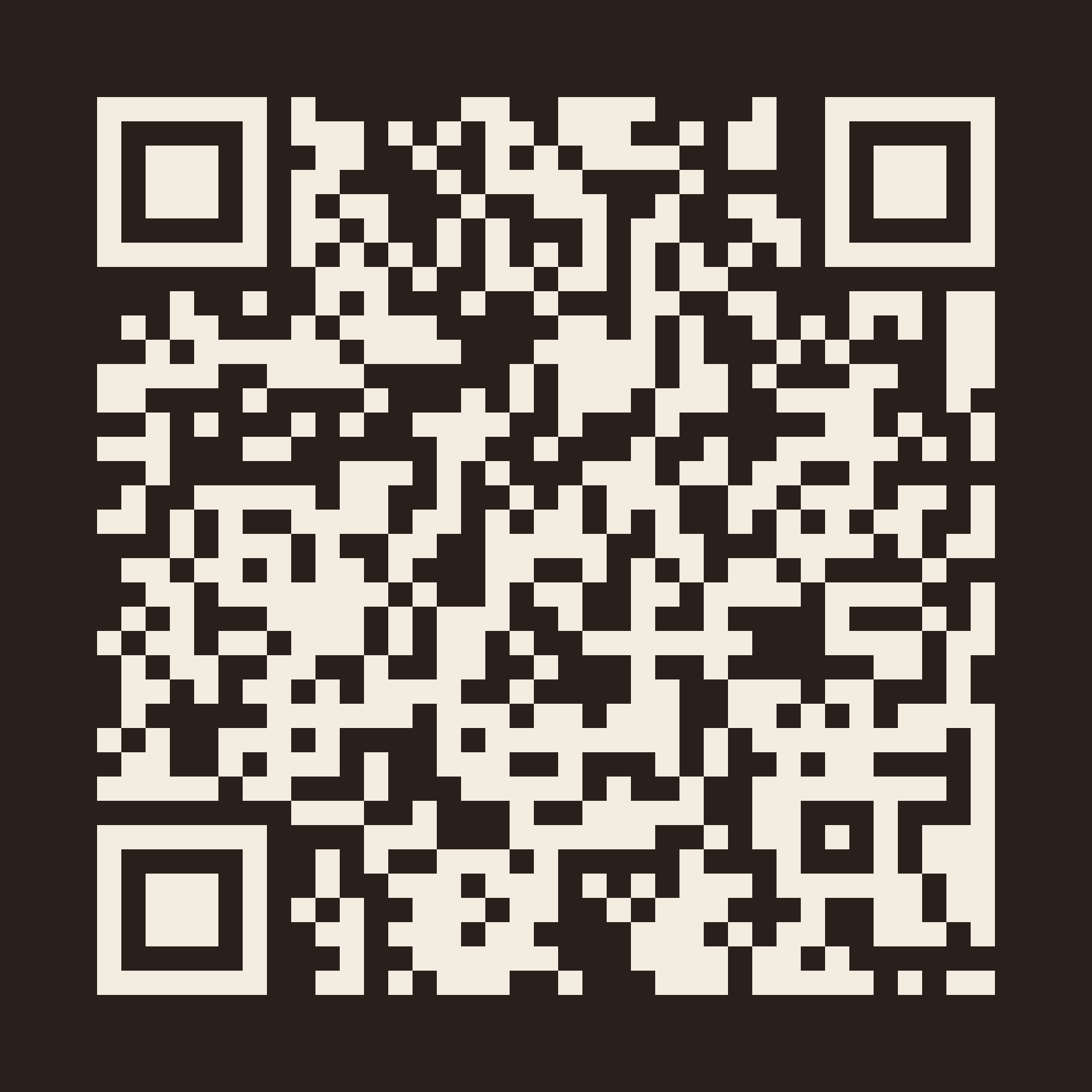
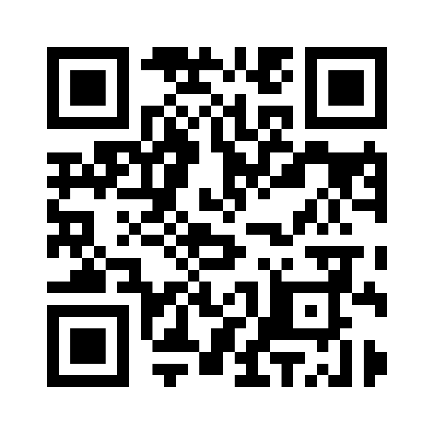
The whole site. For print, packaging, and anywhere the destination is the brand rather than one piece.
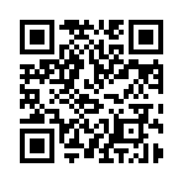

- Use the SVG for print and Canva. The PNG is for anywhere that won’t take vector.
- Ink on Gardenia, or the reversed pair. Never a mid-tone on a mid-tone. Contrast is what a camera reads.
- Keep the white margin. It looks like wasted space and it is the single most common reason a printed code fails to scan.
- Minimum 20 mm in print. Both are built at high error correction so artwork can sit over them. The hang tag in section 06 lays one inside the compass rose.
- Scan the finished artwork before it goes to press. The code that shipped in the Spring 2027 line book pointed at another brand’s shop.
08 · Assets
Take the kit with you.
Wordmark (ink + reversed, and the traced vector), the seal, ligature details, the label and hang tag artwork with print proofs, palette tokens, and a quick-reference spec. The QR codes are linked in their own section above.